
Brand Identity · Website · UI/UX · Video Production
ForceEquals
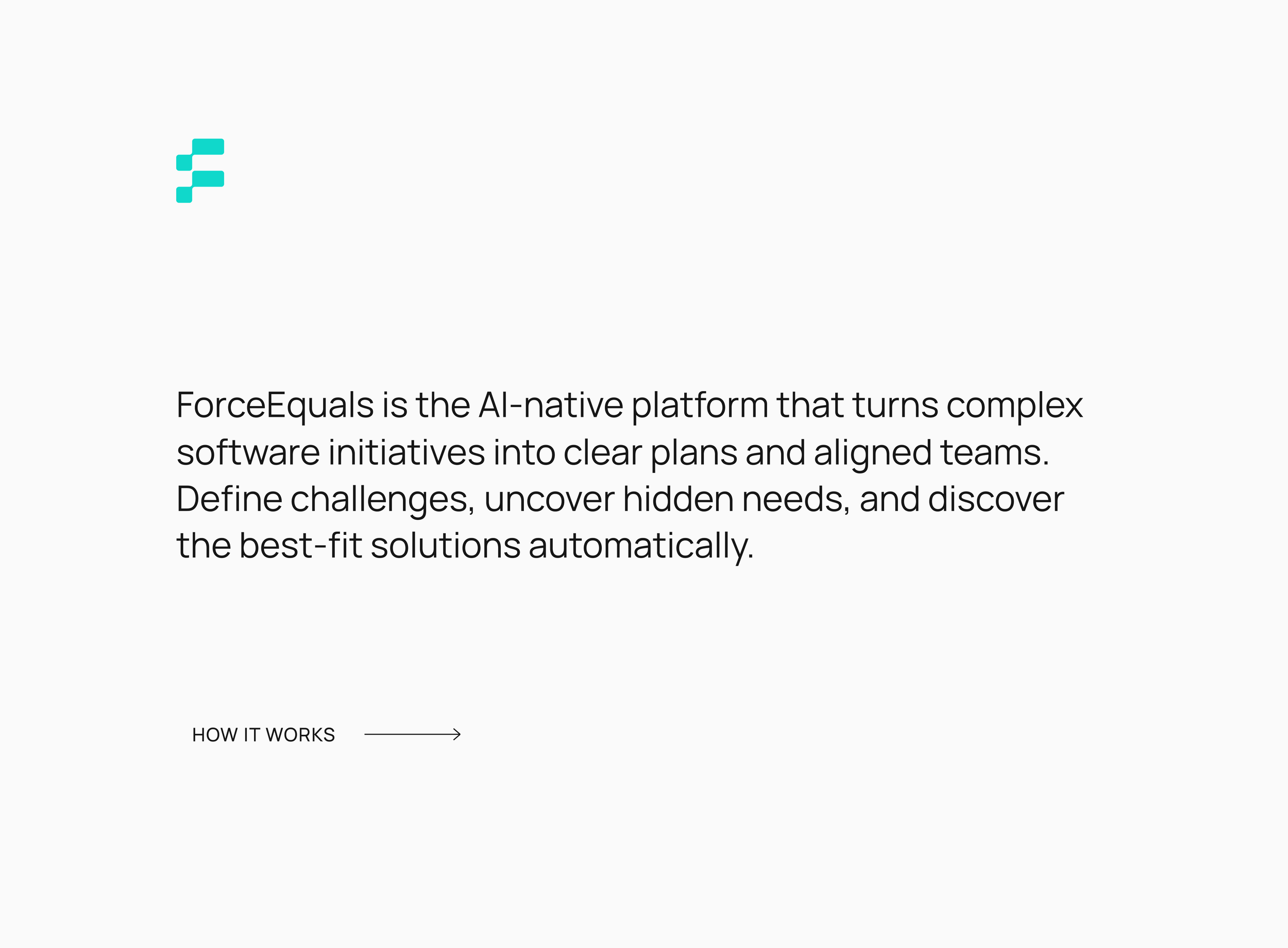
ForceEquals is an AI-native platform that transforms complex software initiatives into clear, actionable plans and aligned teams. It helps define challenges, uncover hidden needs, and automatically generate best-fit solutions.
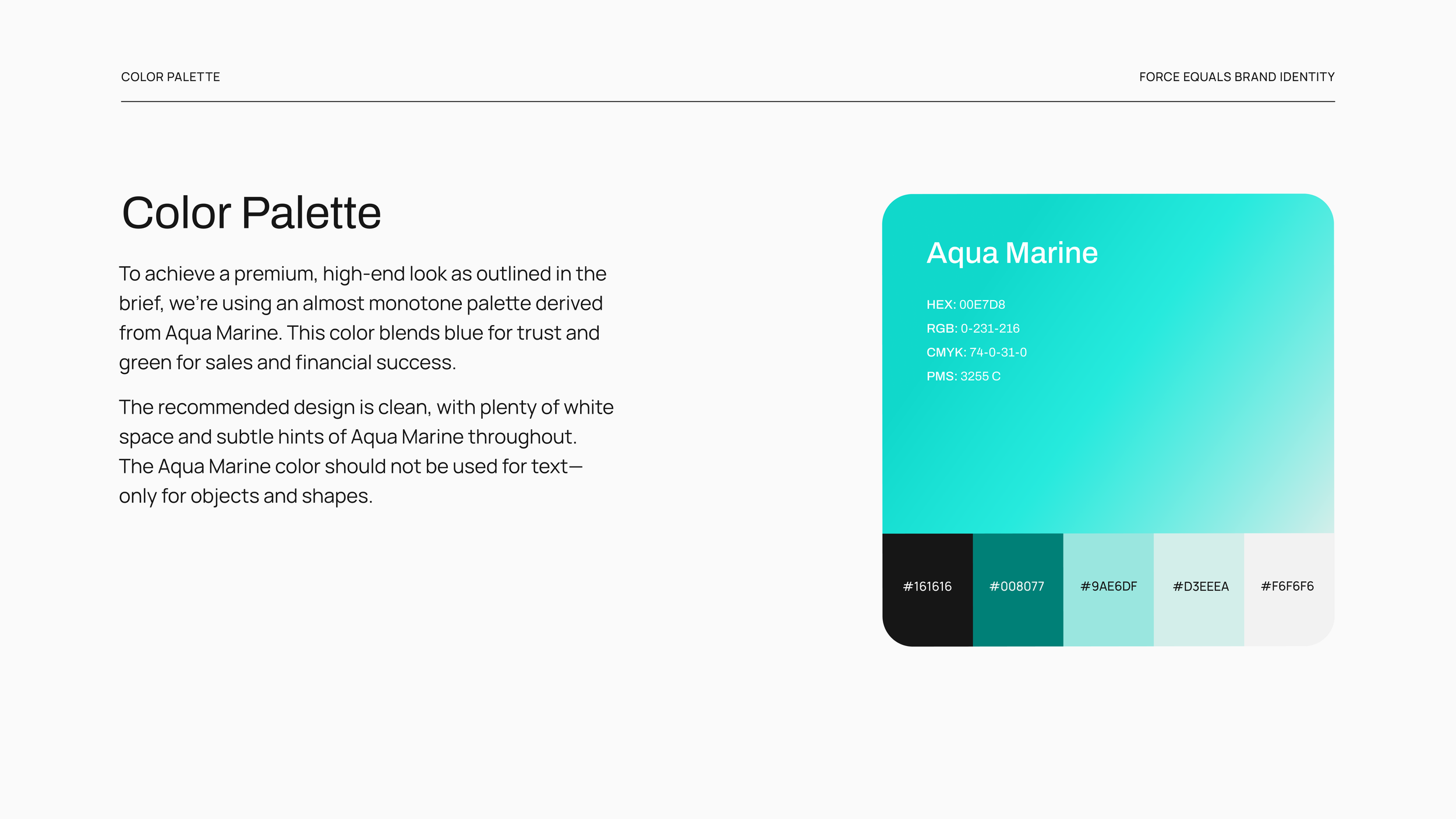
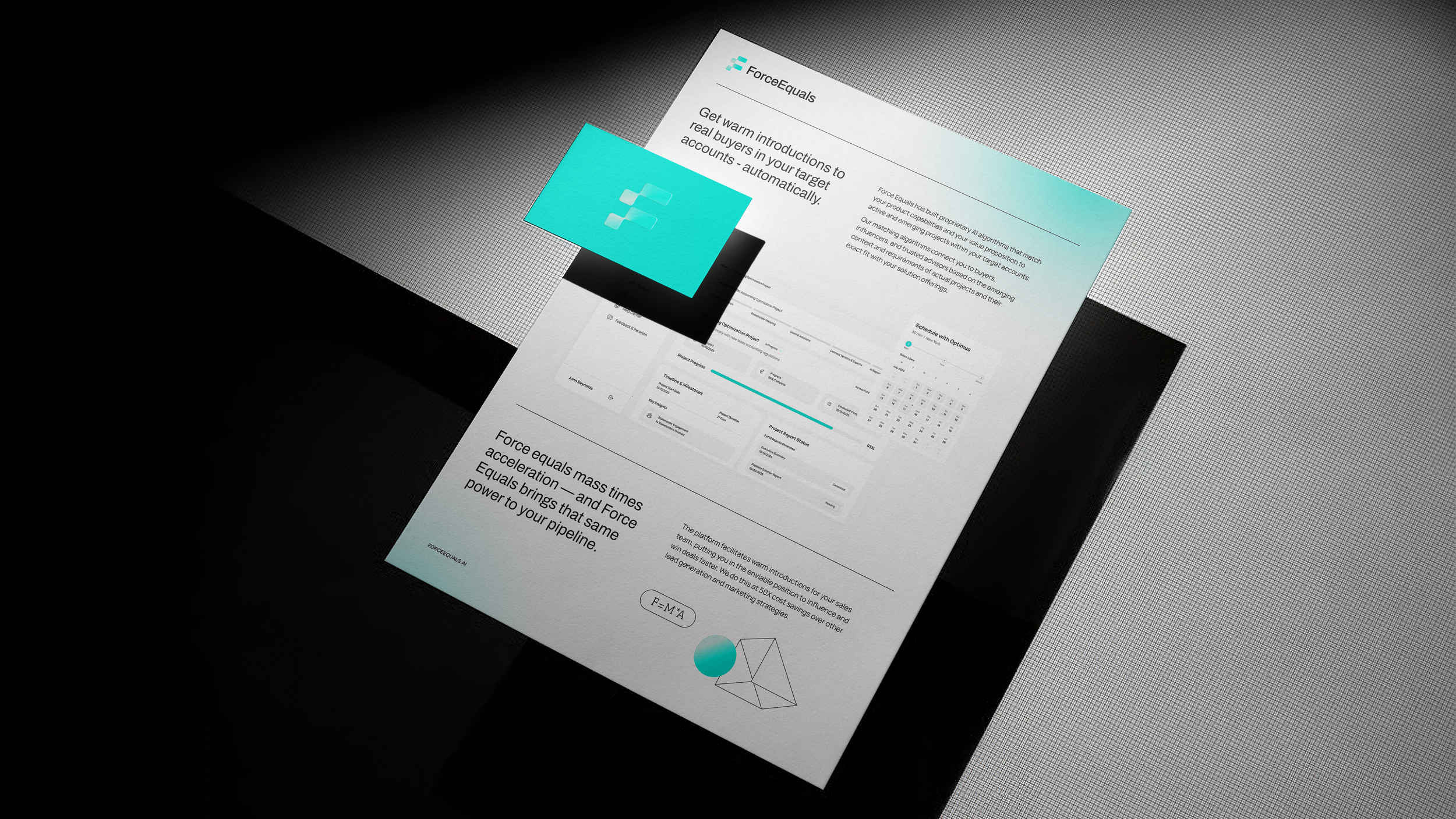
I led the creation of a full brand identity designed to feel premium, simple, and high-end, as outlined in the brief. The direction centers on a product-first, AI-forward aesthetic supported by a calm, neutral color palette. The branding was especially interesting because, like many startups, the product vision evolved rapidly. What began as a simple matchmaking tool grew into a fully automated AI project planner—able to generate plans, timelines, stakeholder maps, and even a live app with just a few clicks.
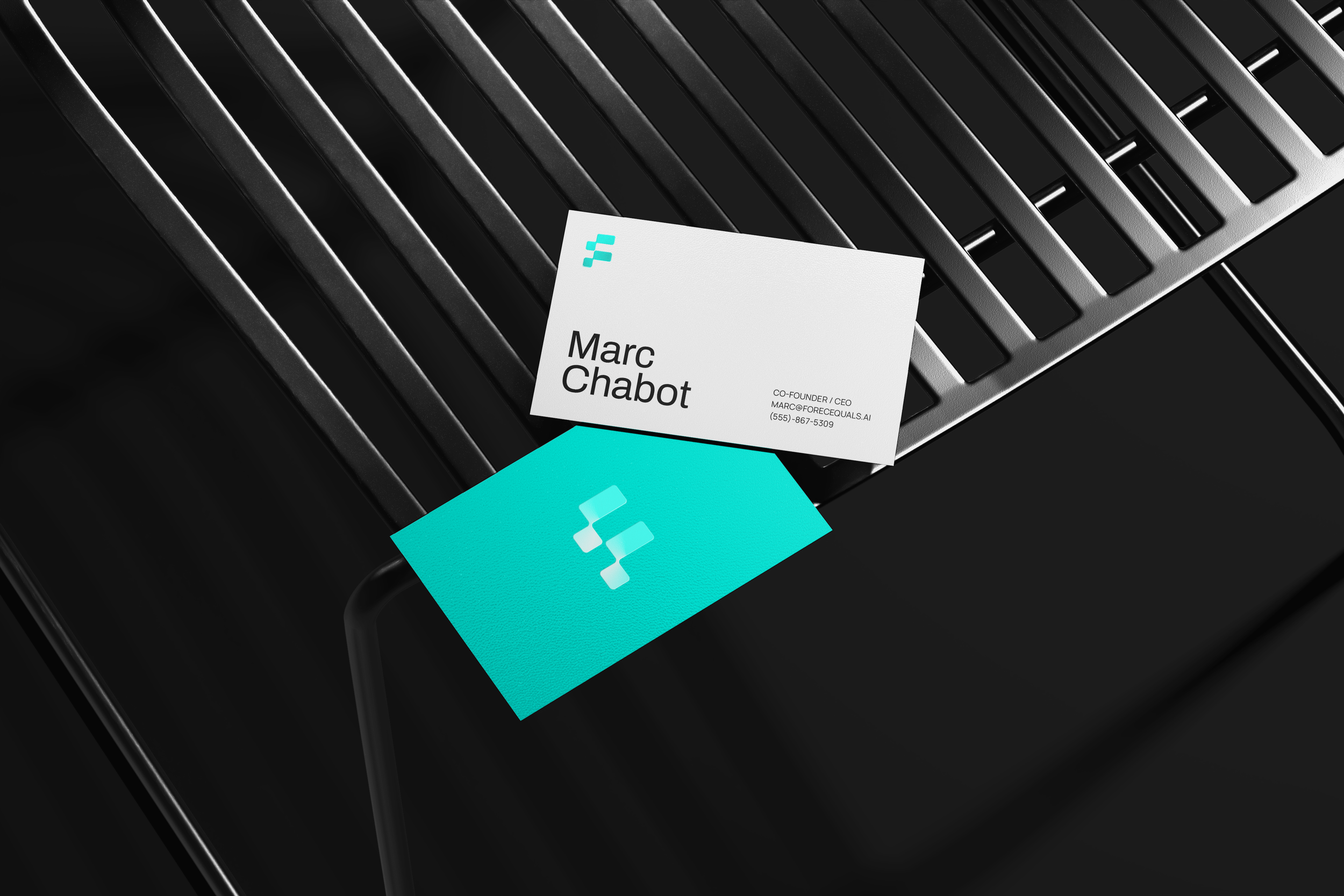
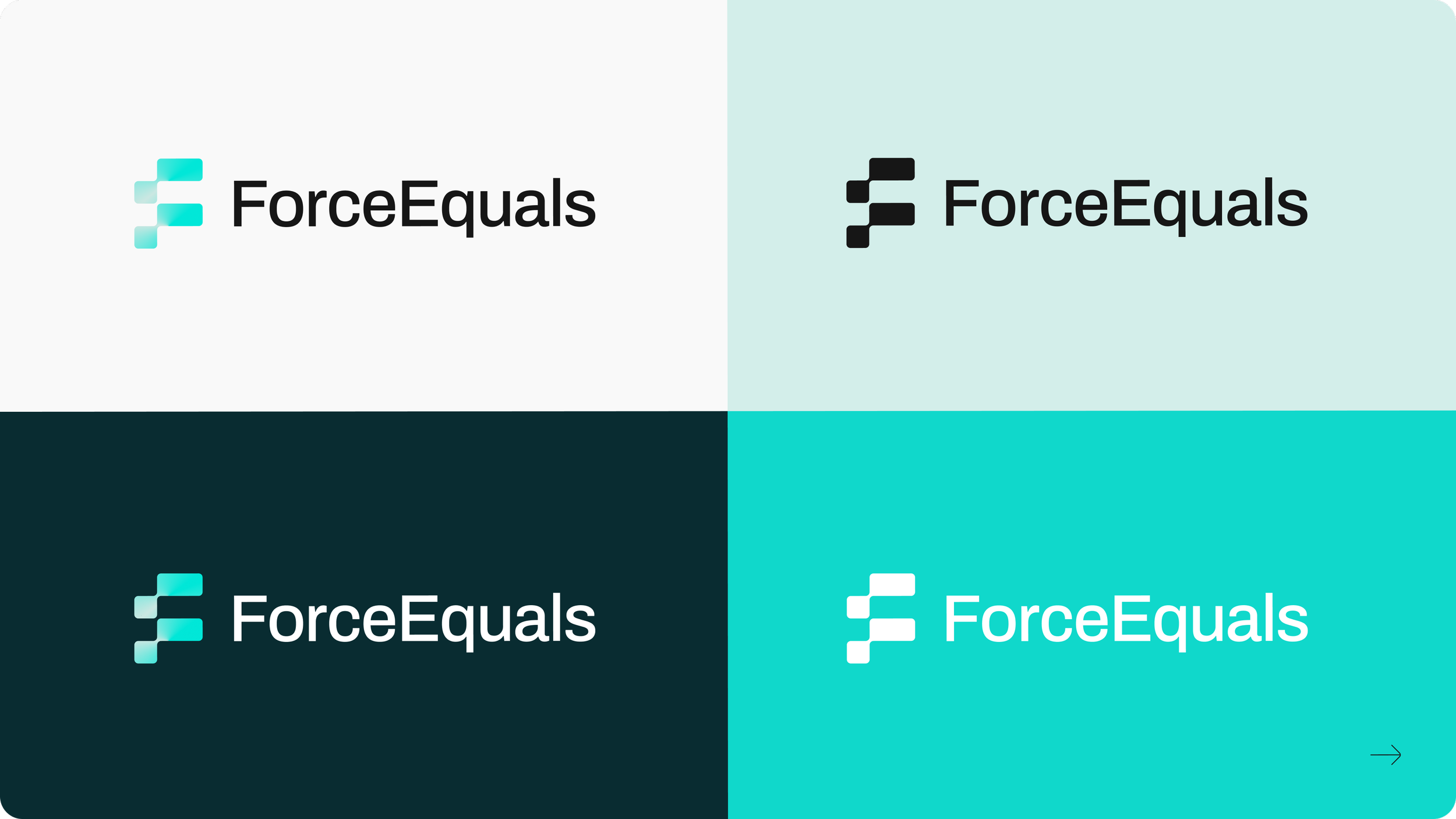
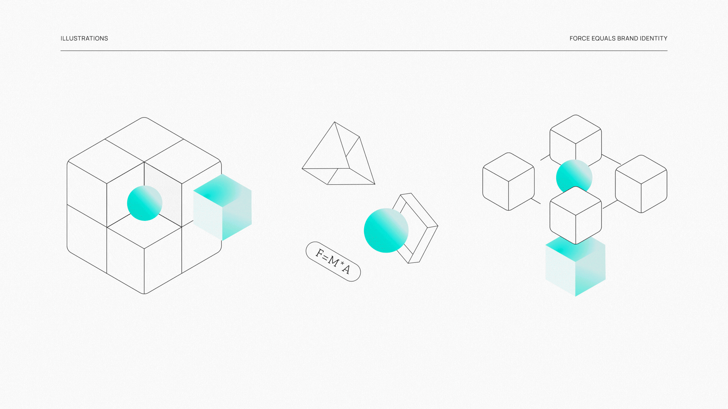
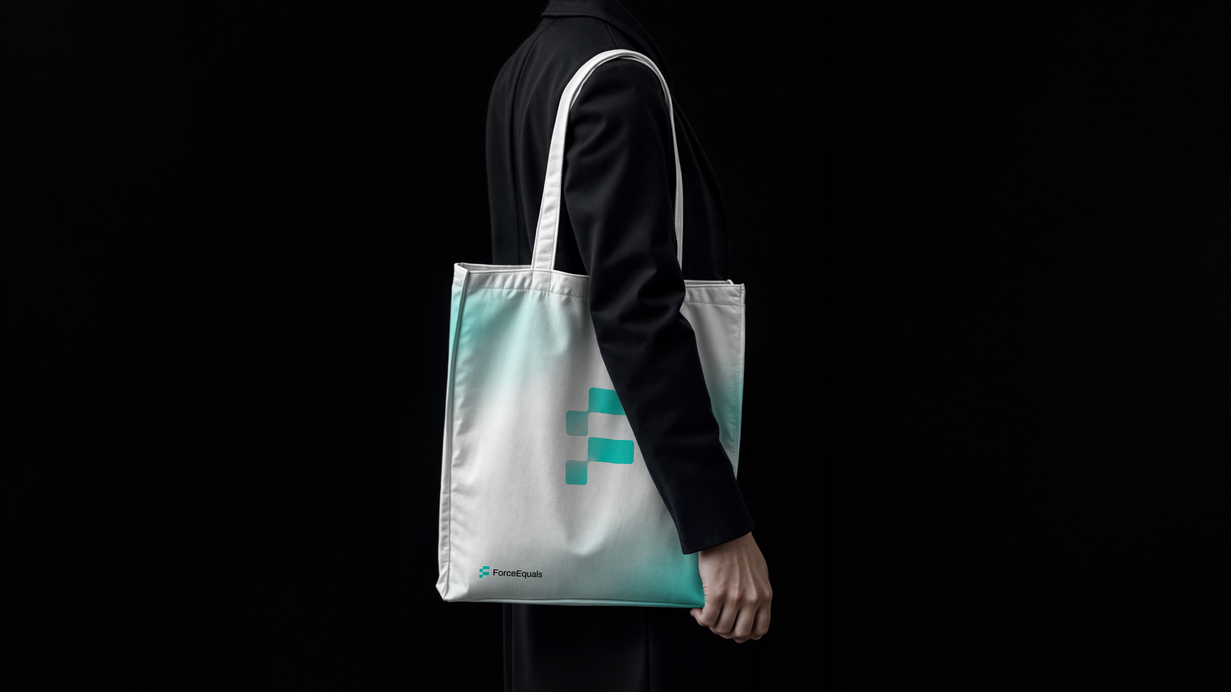
The logo combines a monogram of the letters ‘F’ and ‘E’ with an equal sign, creating an abstract and modern symbol. This design provides a dynamic foundation for shapes and animations, as demonstrated by the geometric pattern on the right. The logo and pattern are crafted from the same elements to ensure a cohesive, contemporary aesthetic.
Logo Rationale

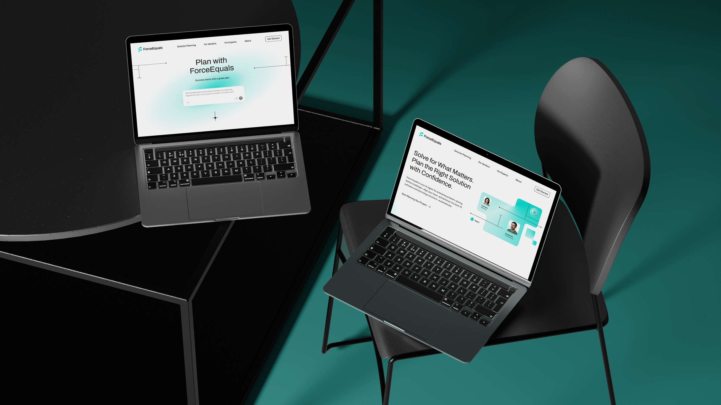
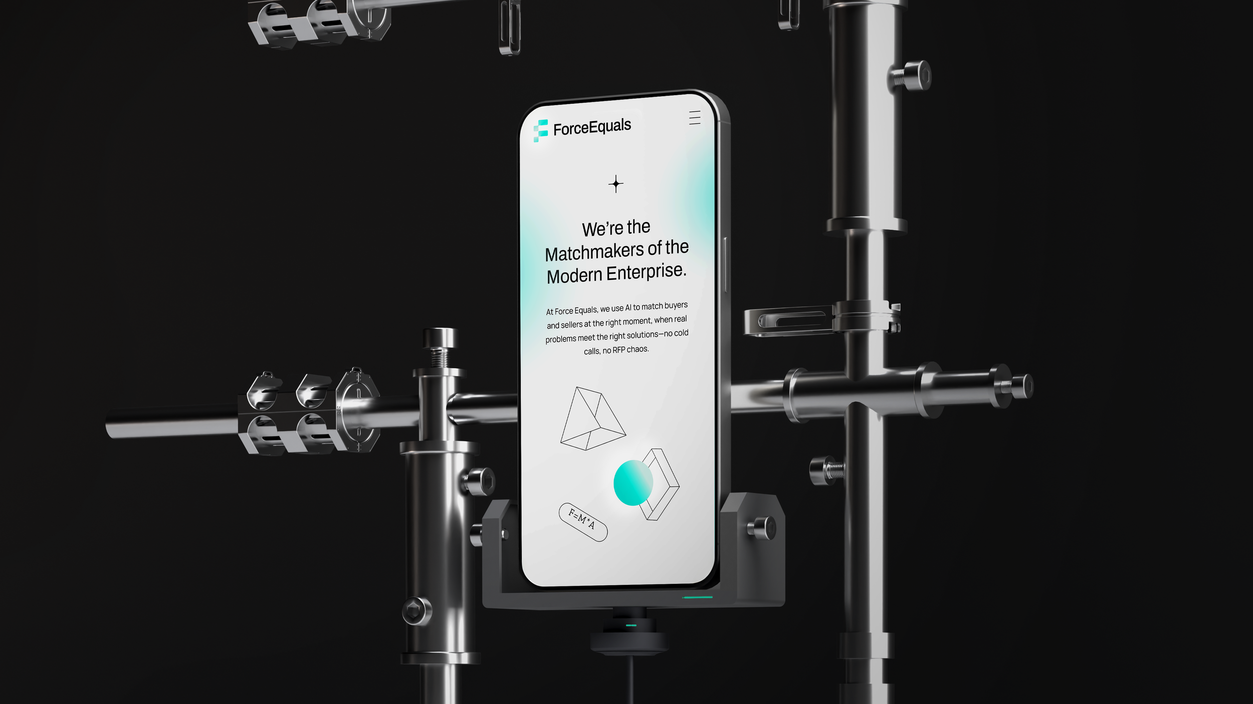
The website’s calm, neutral palette reflects the harmony between AI and human-centered design at the heart of the product. Scroll through the prototype below, and click through to view the next page.
Website
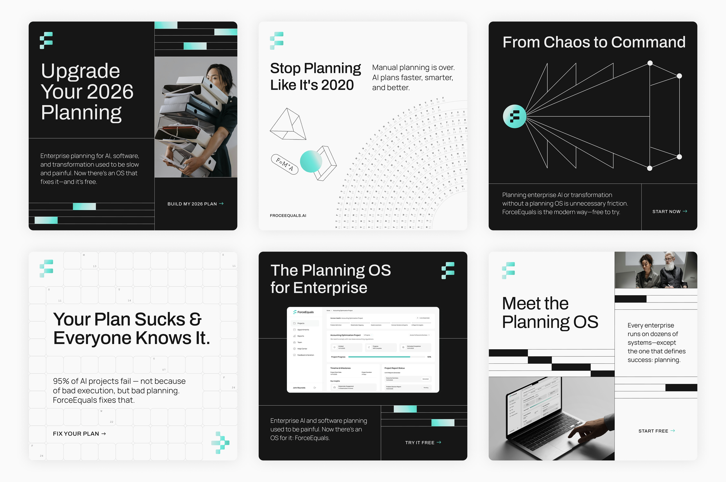
The digital ads provided space to further explore Illustration’s visual style, design elements, imagery, and a cohesive integration of product and color.
Digital Ads
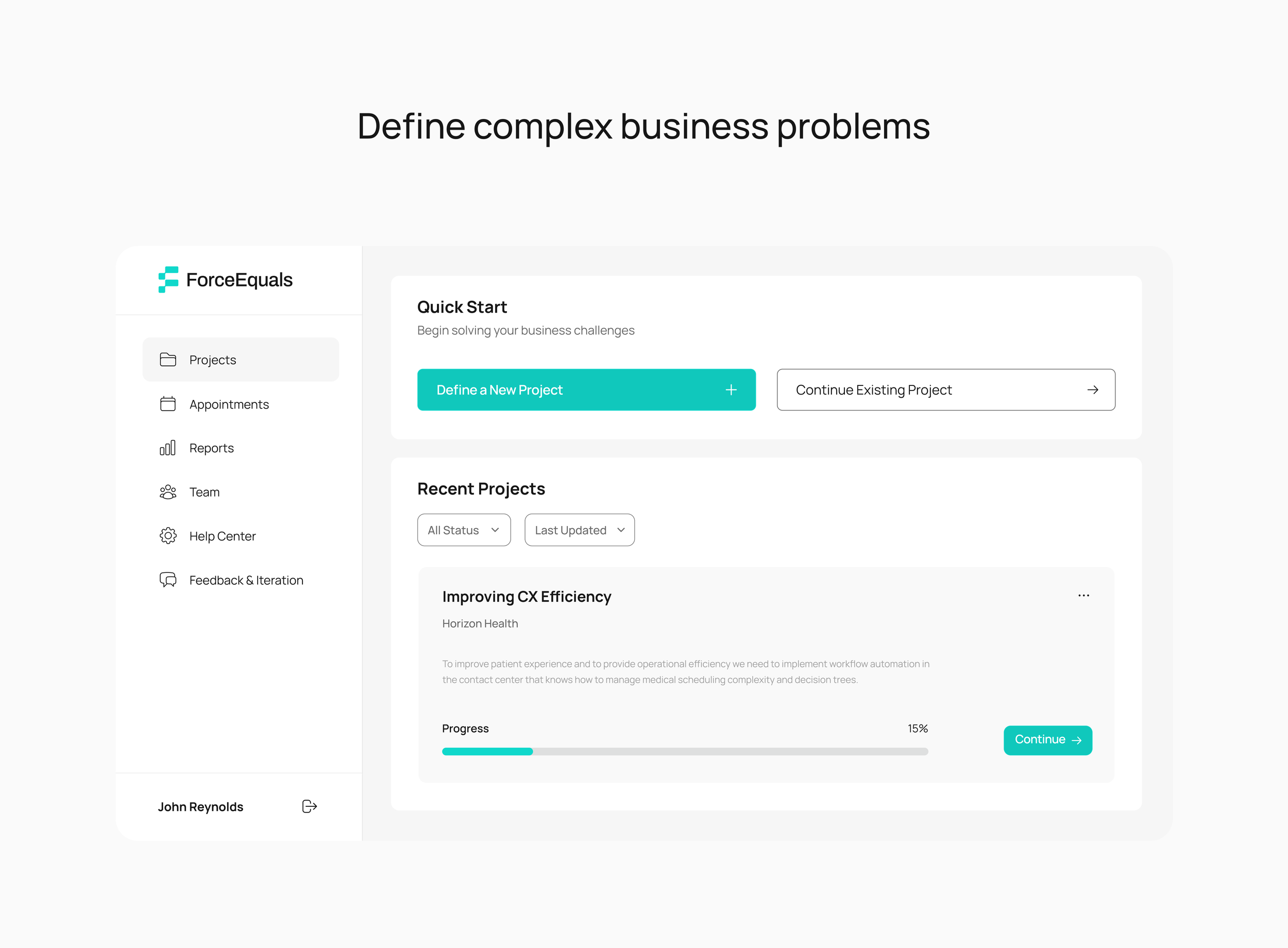
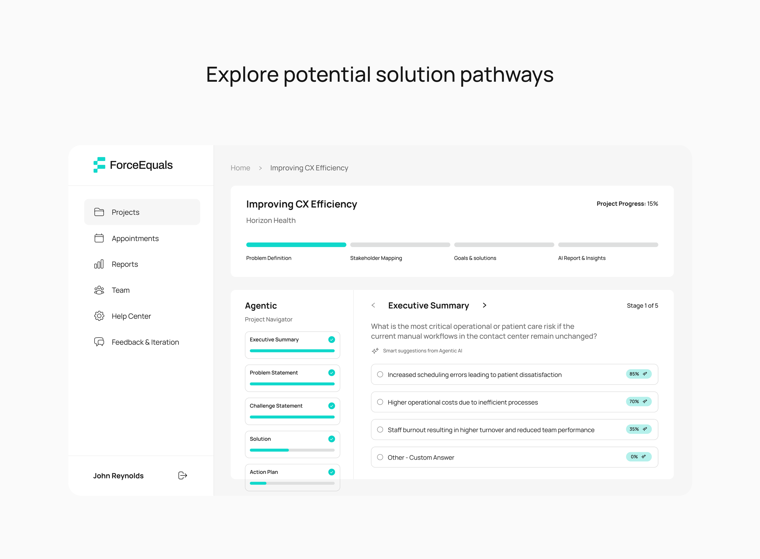
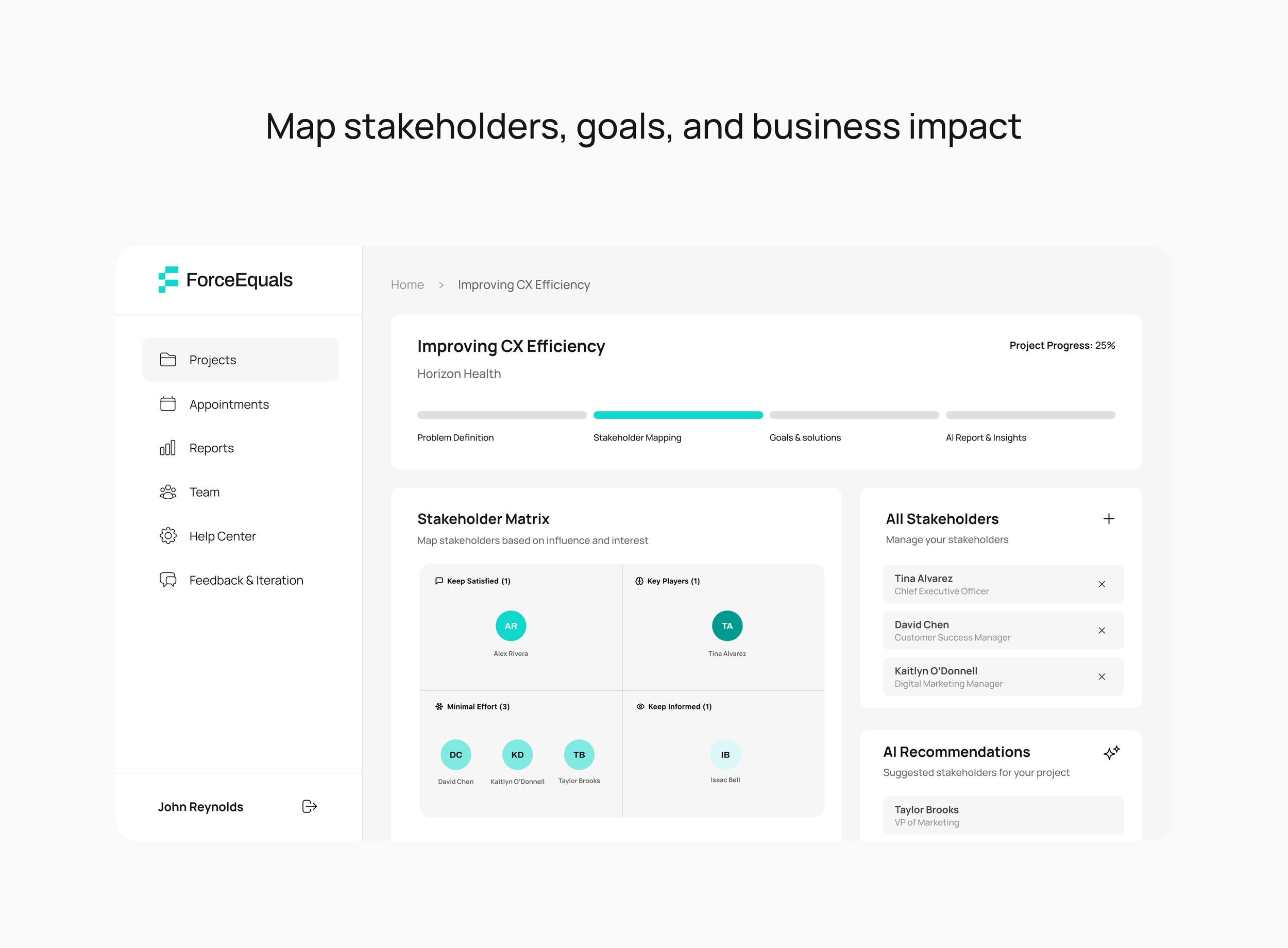
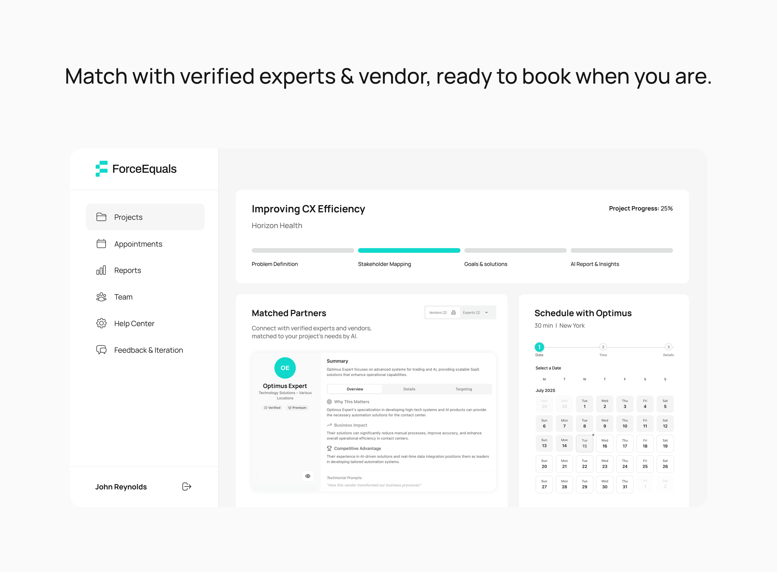
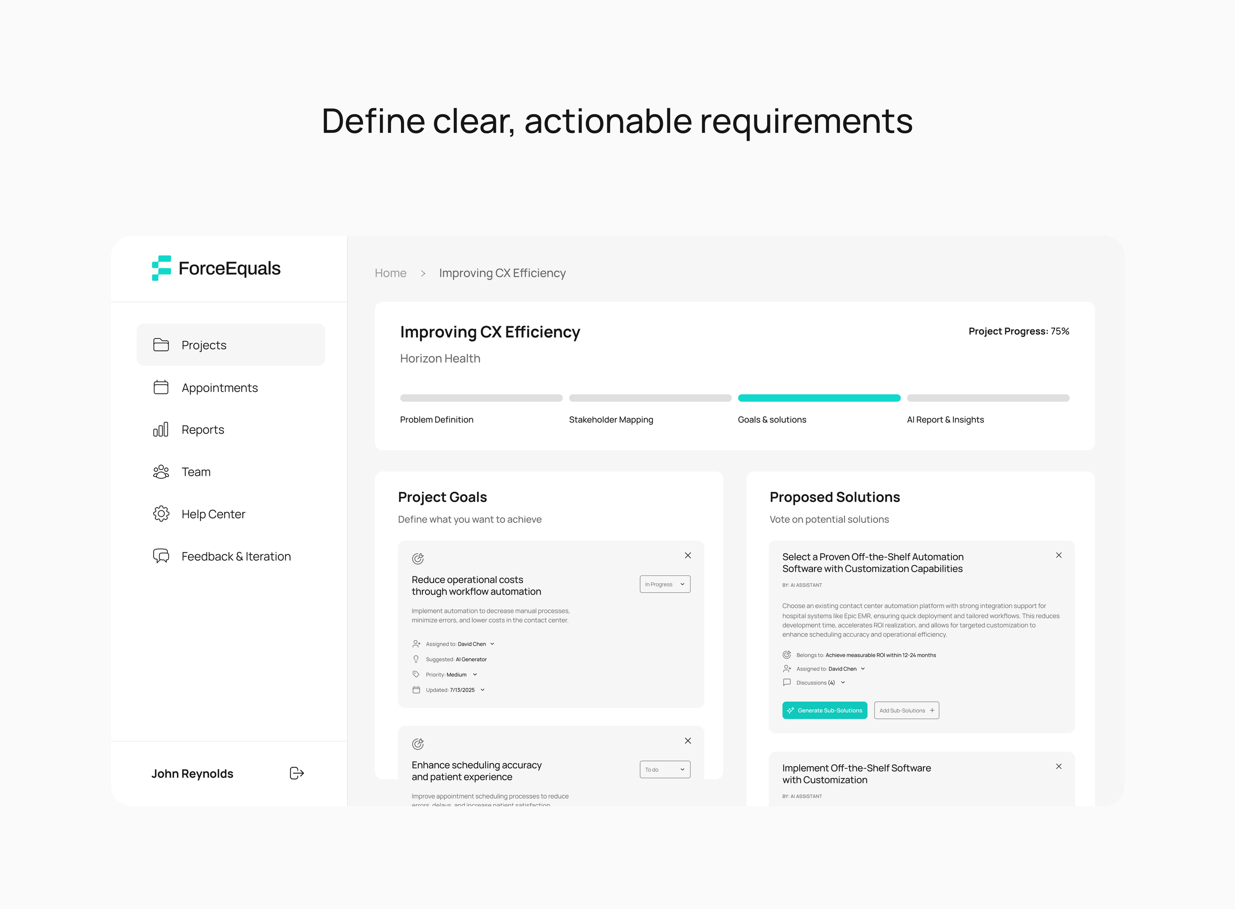
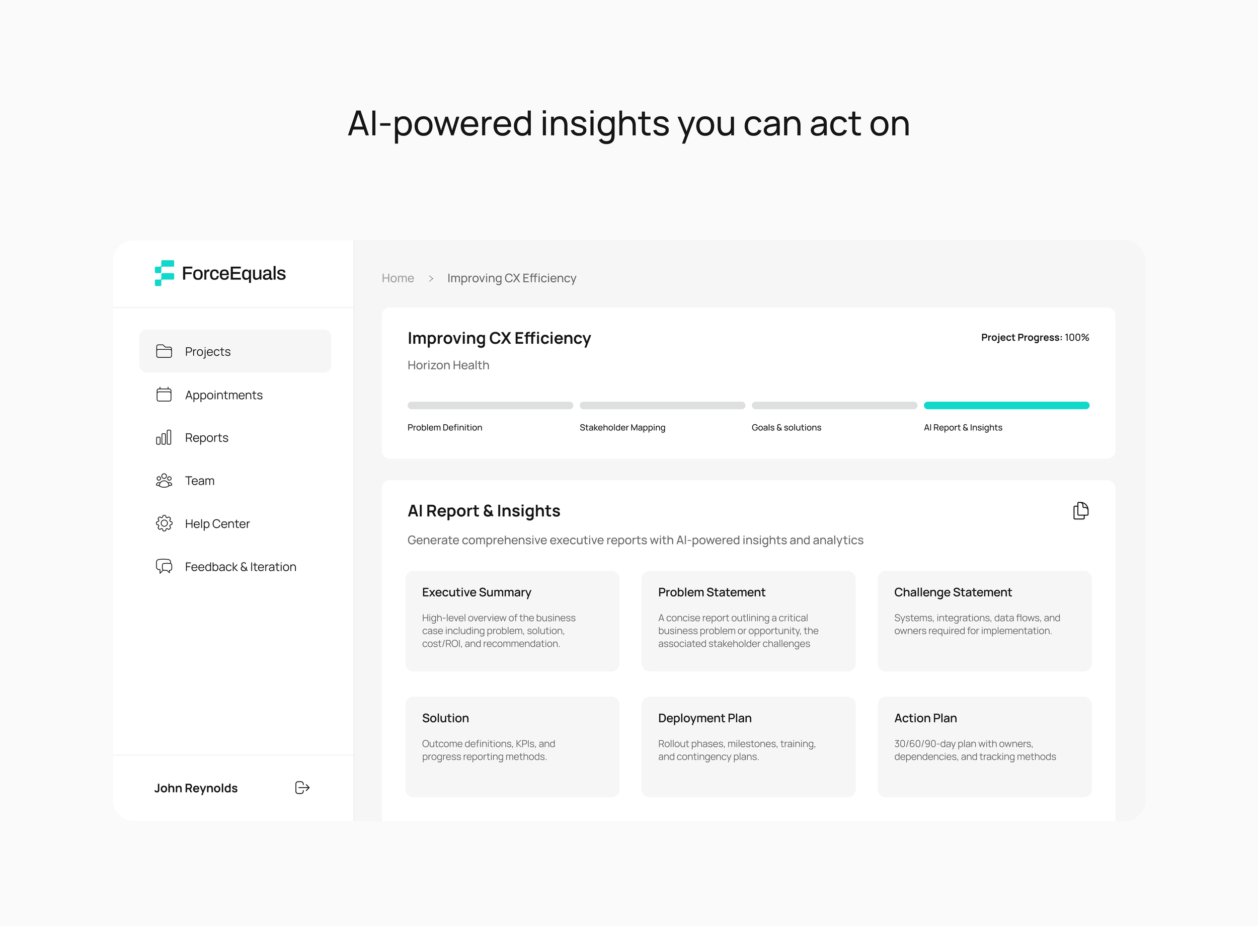
I also designed the product UI, including the screens showcased on Product Hunt. The video below is the explainer I created, and beneath it are the Product Hunt UI screens.
Product UI
Video Production
I created the first promo on the right early in the product’s journey. As the product evolved throughout the year—growing in clarity, capability, and vision—that original piece eventually led to the new promo featured on the left.