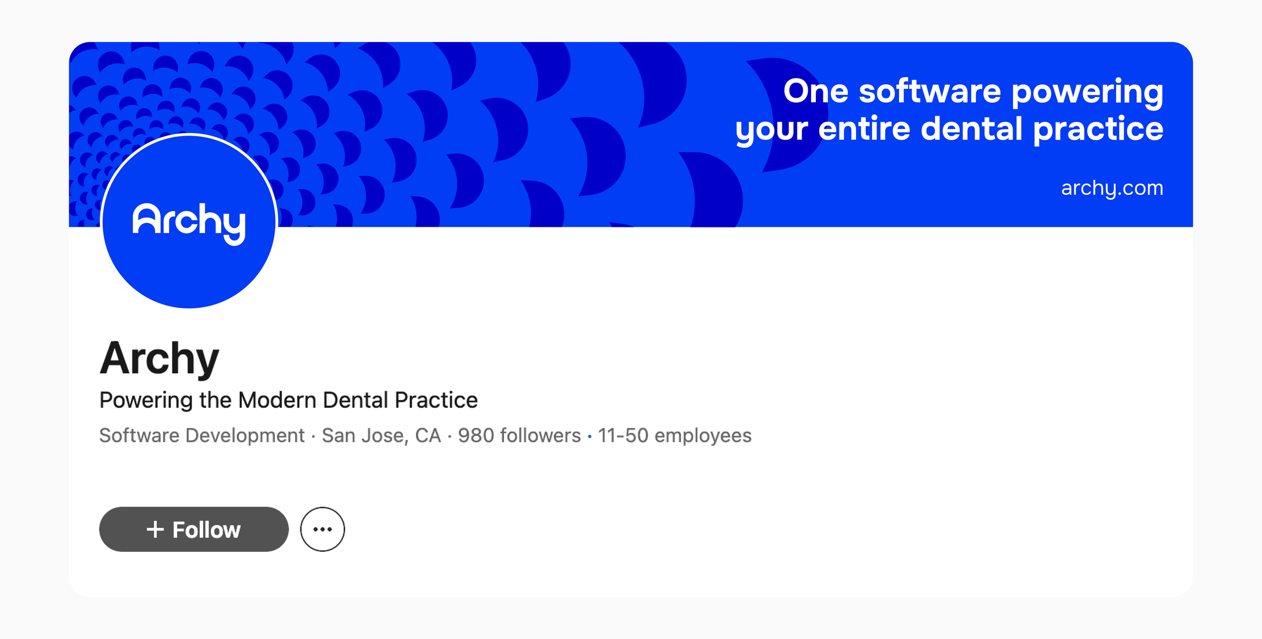
Archy
Identity Rebrand · Digital & Print Design
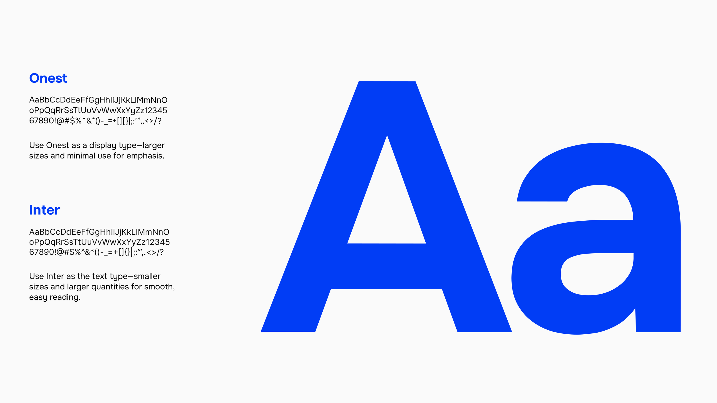
Archy is a dental practice management platform that streamlines scheduling, patient records, billing, and daily operations. I led a complete rebrand of Archy, a dental practice management software, transforming an outdated, overly literal identity into a modern, timeless brand system. The refresh included a streamlined new logo, new color palette, and a cohesive icon set. I designed digital ads, web assets, and UI applications to ensure the brand translates seamlessly across the product experience. The rebrand also extended into print with booth design, mailers, event collateral and swag—creating a unified, contemporary identity at every touchpoint.
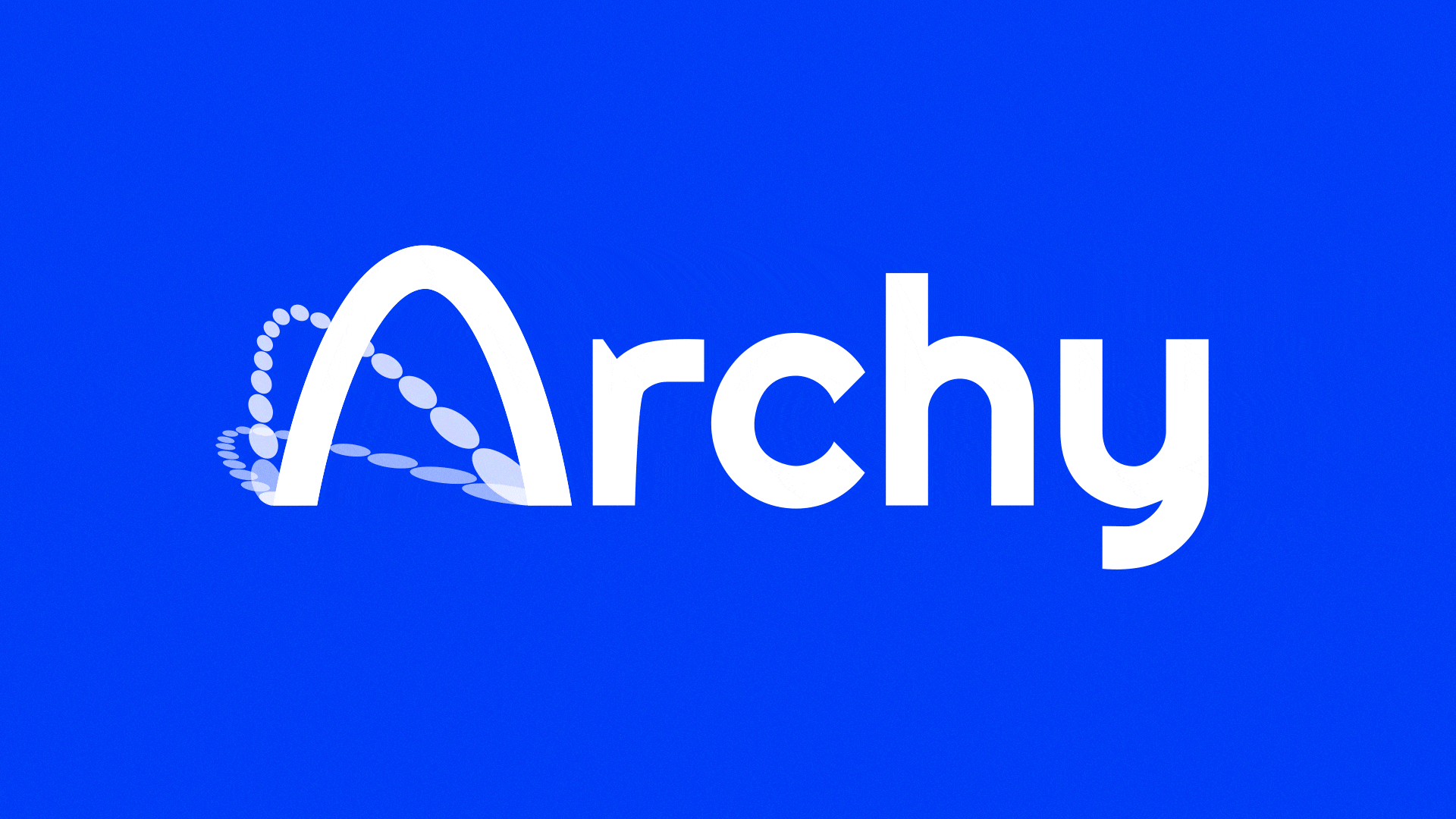
Logo Rationale
The symbol uses negative space to suggest a simple, welcoming smile—subtle “eyes” and a curved “mouth.” It replaces the old, overly literal mark with something more universal and modern, while still hinting at the friendliness expected in dental care.

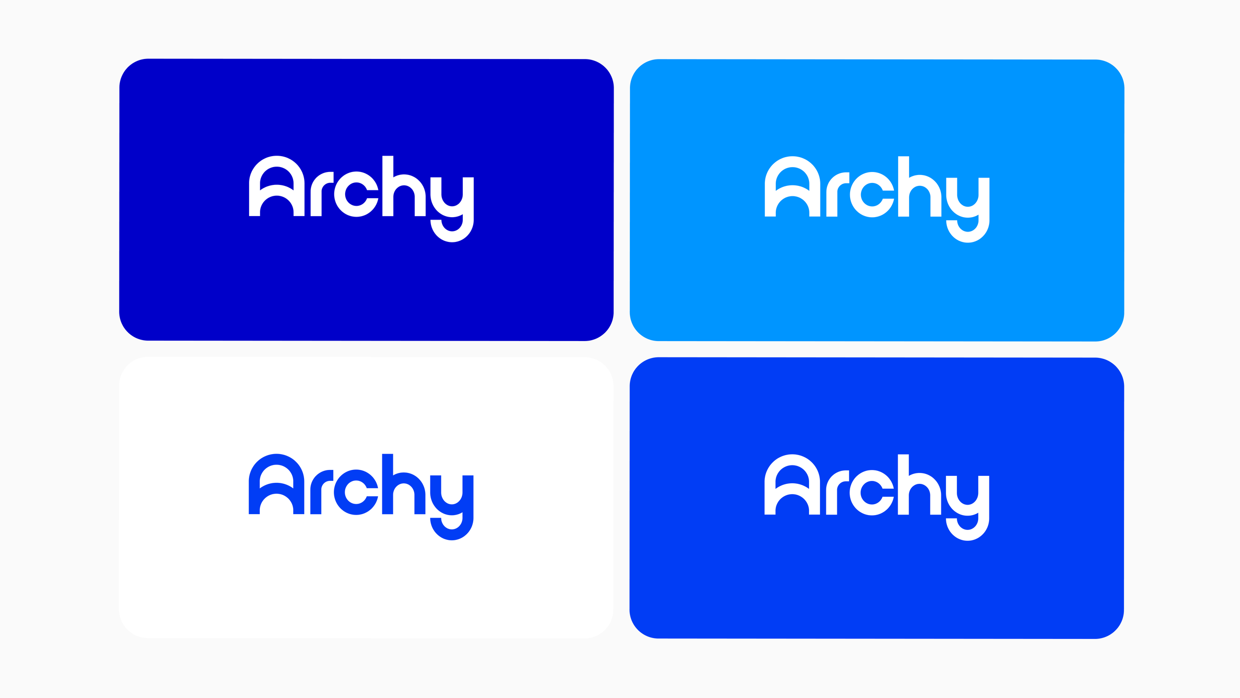
Identity Approach
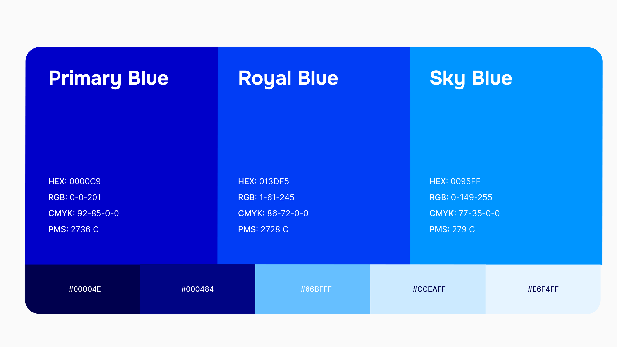
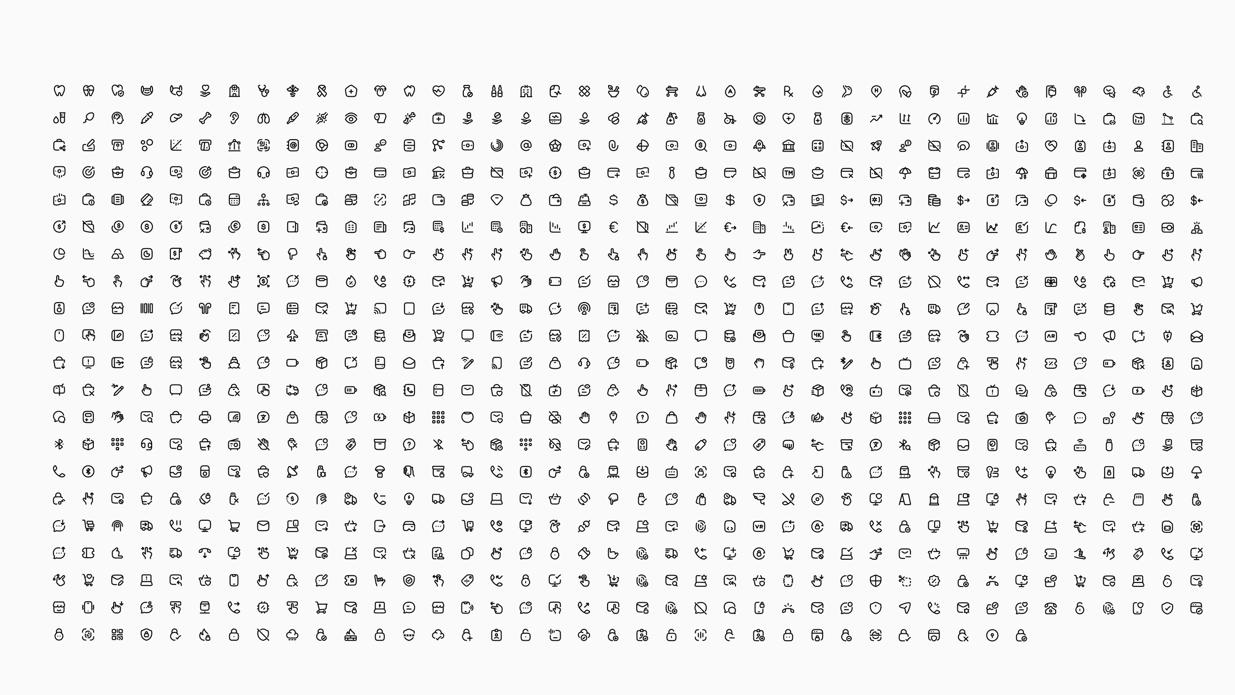
Built around vibrant, scrub-inspired blues and soft, rounded typography, the Archy identity feels instantly dental and inherently friendly. The logo’s subtle negative-space smile carries through the whole system—even the rounded icon set, which mirrors the logo’s curves for a cohesive, modern look.
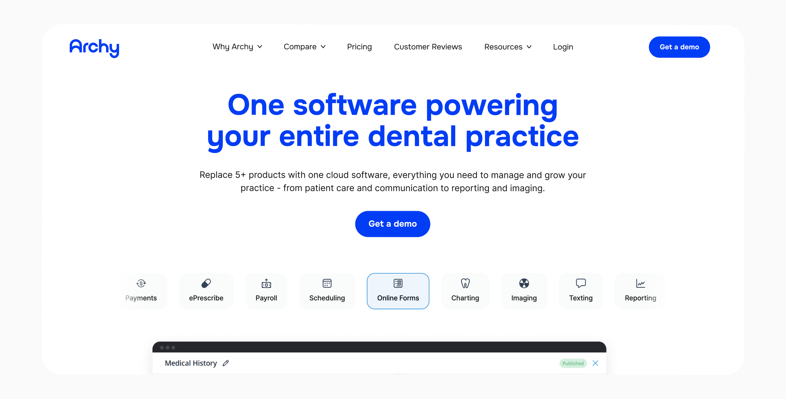
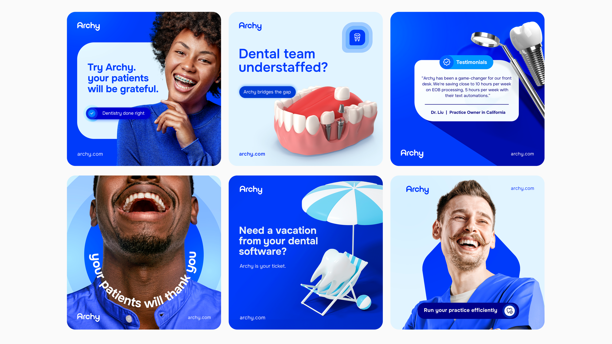
Digital Ads
As part of the rebrand, we tested how the new system performs in real use by creating social media ads. These showcased the refreshed colors, rounded typography, smile-inspired patterns from the logo’s negative space, and a clean, approachable photography style that aligns with Archy’s friendly, modern tone.
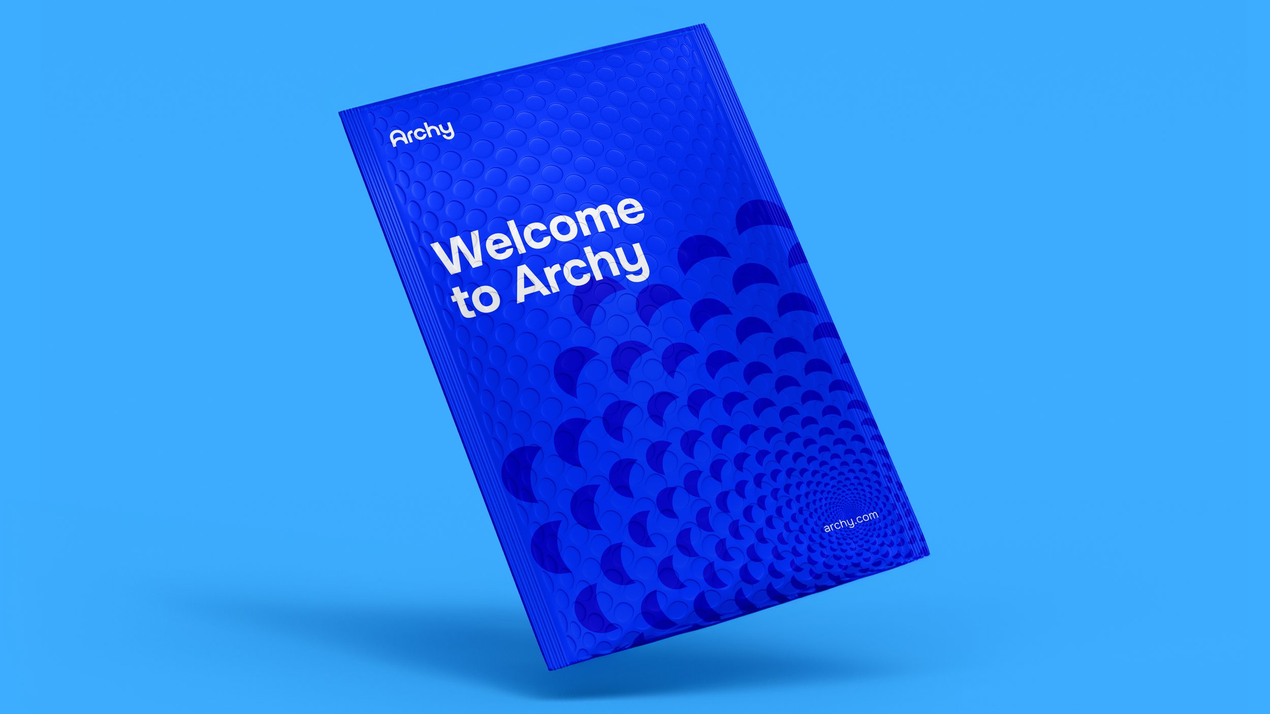
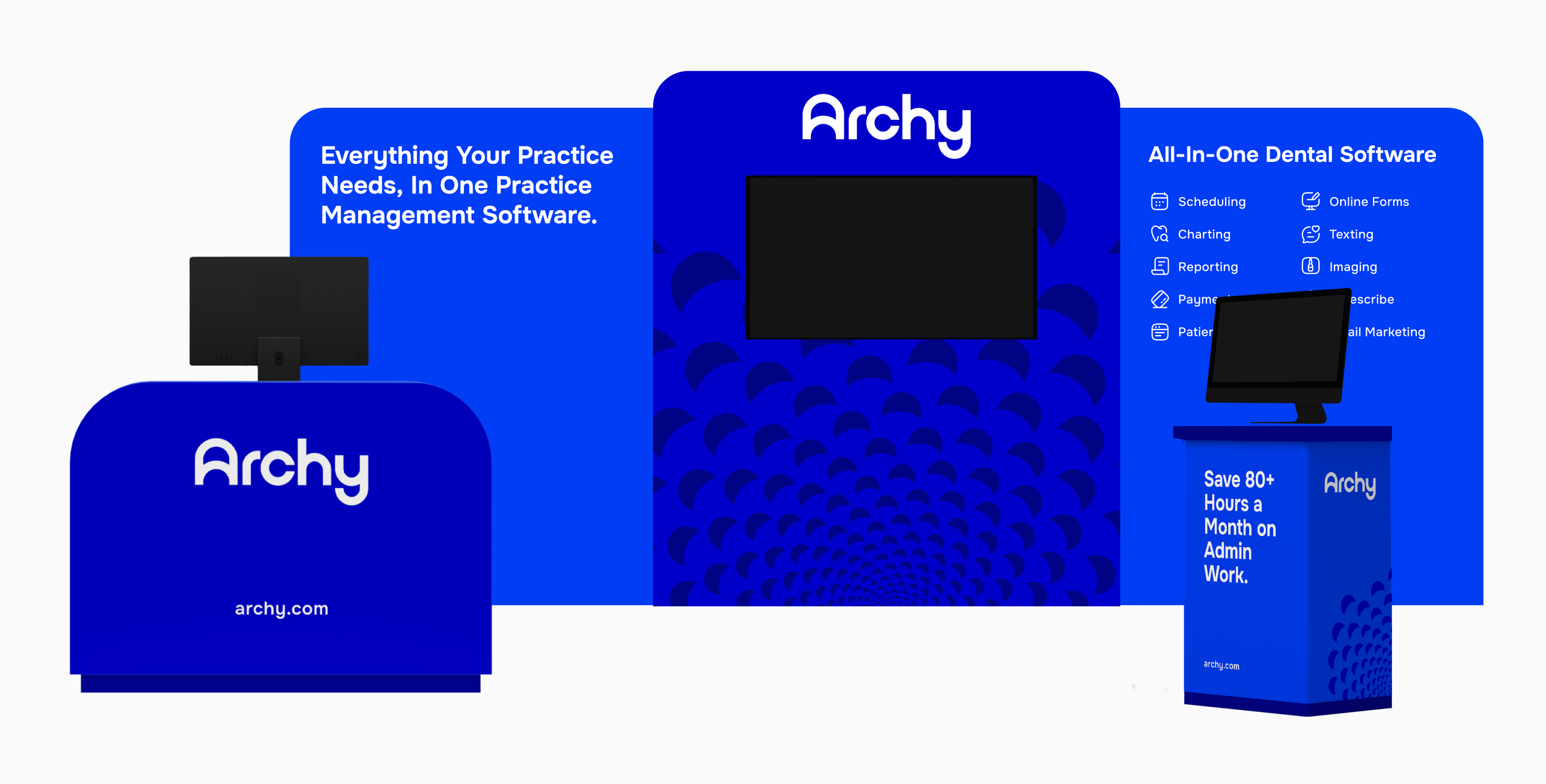
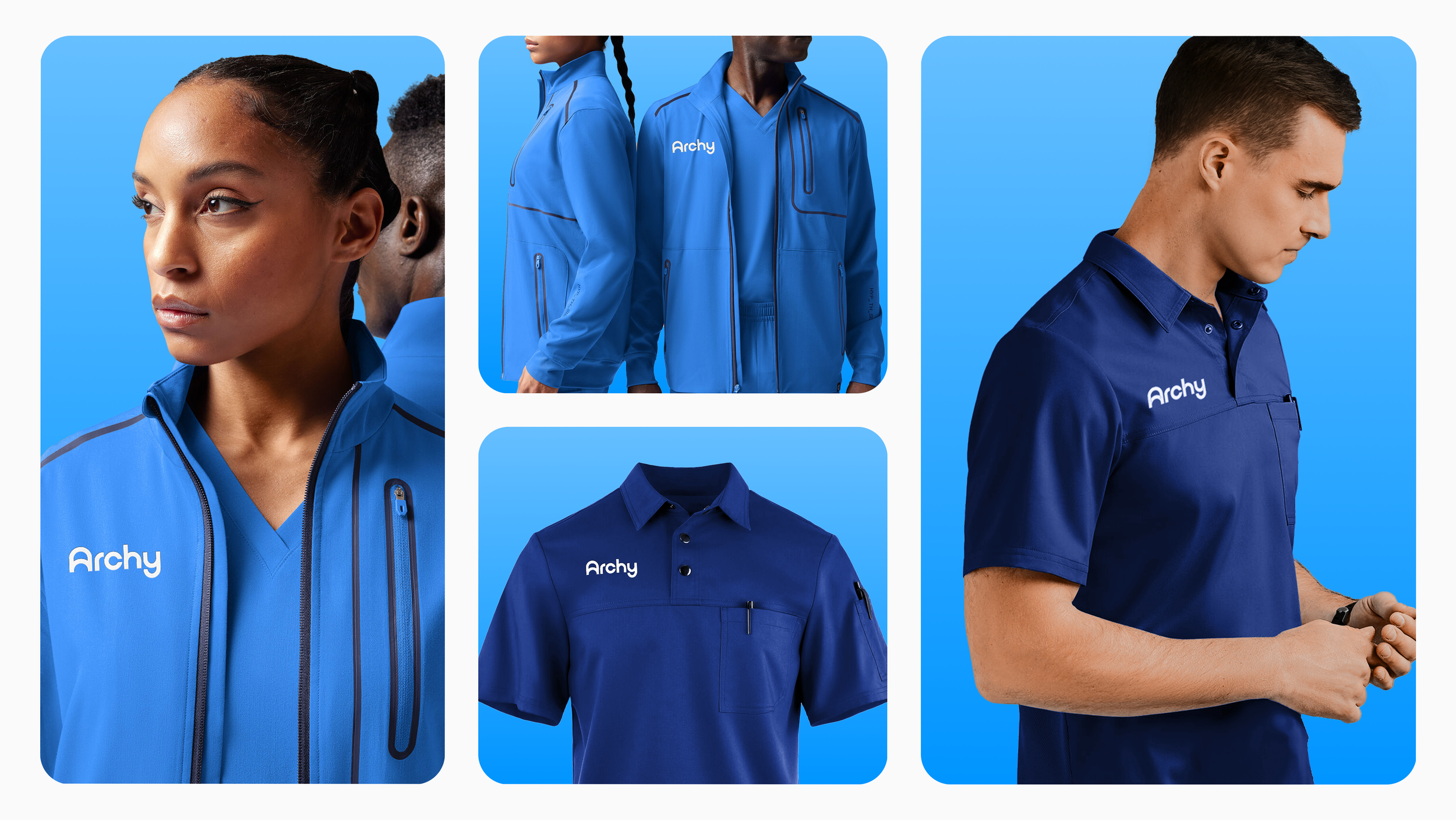
Print Work
Our print presence brought the friendliness and vibrancy of the new Archy identity into the physical world. From the welcoming mailer packet to the event booth, everything carried bold, energetic color pops and rounded iconography that stood out while communicating clearly without being overly literal.